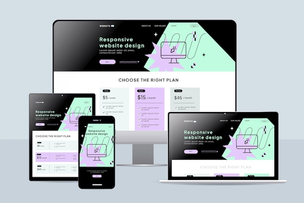
In today’s digital landscape, users access websites from a wide array of devices—smartphones, tablets, laptops, and desktops. This shift in user behavior has made responsive web design an essential part of building an effective and user-friendly online presence. Responsive web design ensures that your website adjusts seamlessly to any screen size or device, providing a smooth and enjoyable user experience. As mobile traffic continues to increase, adopting responsive design is no longer optional for most businesses. Let’s explore why responsive web design is crucial for both user satisfaction and your website’s success.
Enhances User Experience
Responsive web design directly enhances the user experience by ensuring your website looks and functions properly on all devices. With more users browsing websites on smartphones and tablets, ensuring accessibility on these platforms is vital. A website that doesn’t adjust to the user’s screen size can lead to frustration, making users abandon your site for a competitor’s. When users have a positive experience, they are more likely to engage with your content, make purchases, and return for future visits. This ultimately leads to higher customer satisfaction and retention.
How Responsive Design Improves User Experience:
- Better navigation across devices.
- Avoids the need for zooming or scrolling horizontally.
- Faster load times, enhancing usability.
- Mobile-friendly images and content.
- Clear and concise call-to-action buttons.
Watch Live Sports Now!
Dont miss a single moment of your favorite sports. Tune in to live matches, exclusive coverage, and expert analysis.
Start watching top-tier sports action now!
Watch NowSEO Benefits
Responsive web design has significant benefits for your website’s SEO performance. Search engines like Google prioritize mobile-friendly websites in their search results, meaning that sites with responsive design have a better chance of ranking higher. In addition to improving rankings, responsive design also reduces bounce rates by providing a more cohesive browsing experience. Having a single URL across devices helps search engines index and crawl your content more efficiently, boosting visibility. By adopting responsive web design, you’ll be optimizing your website for both users and search engines.
SEO Advantages of Responsive Design:
- Single URL for all devices.
- Improved mobile search rankings.
- Faster page load times.
- Reduced bounce rates.
- Enhanced mobile search visibility.
- Easier content sharing.
- Better integration with social media.
Cost Efficiency
Responsive web design is a more cost-effective solution compared to developing separate websites for mobile and desktop platforms. Rather than managing multiple websites for different devices, a single responsive site can handle all traffic. This eliminates the need for additional development and maintenance costs associated with creating a mobile-only site. Additionally, any changes made to the design or content of your site are reflected across all platforms, saving both time and money. By adopting responsive web design, you are investing in long-term savings and a streamlined development process.
Financial Benefits of Responsive Design:
- No need for separate mobile websites.
- Reduced development and maintenance costs.
- Faster implementation of design updates.
- Increased website efficiency and speed.
- Consistent branding across platforms.
- Reduced risk of mobile-specific issues.
- Greater scalability for future updates.
| Feature | Responsive Design | Separate Mobile Design |
|---|---|---|
| Cost of Development | Lower | Higher |
| Maintenance | Single Platform | Multiple Platforms |
| Content Updates | Unified | Requires Separate Updates |
Improves Conversion Rates
Responsive web design can have a direct impact on conversion rates. With more users accessing websites via mobile devices, having a site that’s optimized for smartphones and tablets ensures that you can capture more leads, sales, and conversions. When a website is mobile-friendly, it’s easier for users to complete actions like filling out forms or making purchases. Websites that provide a seamless experience are more likely to convert visitors into customers. This increased ease of use can lead to improved business outcomes.
How Responsive Design Boosts Conversion:
- Easier navigation on mobile devices.
- Mobile-optimized forms and buttons.
- Faster checkout process for e-commerce sites.
- Seamless integration with payment gateways.
- Improved trust through a professional design.
- Increased mobile purchases.
- Higher customer retention.
Future-Proofing Your Website
One of the major advantages of responsive web design is its ability to future-proof your website. As new devices with different screen sizes emerge, a responsive website automatically adjusts to accommodate them. Instead of having to create new designs for each new device or platform, a responsive site ensures that your website is ready for whatever the future holds. This is especially important as the Internet of Things (IoT) continues to expand, and users access websites from an even wider variety of devices. By implementing responsive design, you’re ensuring that your website will continue to work well as technology evolves.
Future-Proof Benefits of Responsive Design:
- Seamless functionality on emerging devices.
- Long-term cost savings by avoiding redesigns.
- Increased flexibility in handling new technologies.
- Consistent user experience across devices.
- Adaptability to changing user needs.
- Scalable design as new screen sizes are introduced.
- Greater sustainability for your website’s performance.
Vote
Who is your all-time favorite president?
Increased Mobile Traffic
As more people access the internet via their smartphones, mobile traffic has skyrocketed in recent years. A responsive design ensures that mobile visitors have an optimized experience, preventing them from leaving your site due to poor usability. According to a report by Statista, mobile internet traffic accounted for more than half of all global website traffic in 2023. This growing trend emphasizes the need for responsive web design to cater to the rising number of mobile users. Websites that don’t adapt to mobile users are at risk of losing valuable traffic and potential customers.
Mobile Traffic Insights:
- Over 50% of global traffic comes from mobile devices.
- Mobile-optimized sites see higher user engagement.
- Mobile-first indexing is becoming standard.
- Mobile searches drive local business decisions.
- More people use mobile devices to shop online.
- Smartphones are used for both browsing and buying.
- Mobile users expect fast, responsive experiences.
“Responsive web design is no longer just an option; it’s a necessity for modern websites. As mobile usage continues to grow, having a site that adapts to different screen sizes is crucial for user engagement, SEO, and conversion rates. By focusing on responsive design, you ensure that your website remains accessible and effective across all platforms.”
Better Website Speed
Website speed is a critical factor in both user satisfaction and SEO rankings. A responsive design ensures that your website loads quickly on all devices, especially on mobile, where users expect fast, seamless experiences. Websites that take too long to load risk losing visitors, as studies show that users tend to abandon slow-loading websites. By optimizing your site for mobile devices, you can reduce load times and keep visitors engaged. This increased speed not only benefits the user experience but also improves your site’s ranking on search engines.
How Responsive Design Improves Website Speed:
- Faster load times across all devices.
- Mobile-optimized content for quicker access.
- Reduced bounce rates due to speed.
- Optimized images and media for mobile devices.
- Improved performance in Google’s PageSpeed Insights.
- Less resource consumption on mobile devices.
- Faster navigation on all screen sizes.
Simplifies Analytics and Reporting
A responsive website simplifies your analytics and reporting efforts by consolidating all your traffic data into a single platform. When you have separate sites for mobile and desktop, tracking user behavior and conversion rates can become cumbersome and time-consuming. With responsive web design, all user data is aggregated, making it easier to analyze how visitors interact with your content across different devices. This streamlined approach helps businesses make better-informed decisions when it comes to marketing strategies and content optimization. It allows for a clearer understanding of customer behavior on your website.
Analytics Benefits of Responsive Design:
- Unified tracking of visitors across devices.
- Simplified conversion rate analysis.
- Improved segmentation based on device.
- Better insights into user journeys.
- Streamlined reporting across channels.
- Easier goal setting and tracking.
- Reduced complexity in data analysis.
Improved Brand Consistency
Responsive web design helps maintain brand consistency by ensuring that your website looks and functions the same across all devices. Consistency in design, messaging, and user experience is key to building trust with your audience. A responsive design helps deliver a cohesive brand identity regardless of how users access your site, leading to a stronger, more unified presence online. This consistency also helps establish your brand as professional and reliable, enhancing customer loyalty. By providing a consistent user experience, you ensure that users perceive your brand positively.
Brand Consistency Benefits:
- Consistent visual design across all devices.
- Unified messaging and branding elements.
- Stronger, more professional brand identity.
- Enhanced customer trust and loyalty.
- Cohesive user experience from desktop to mobile.
- Clearer call-to-action elements across platforms.
- Better brand recall among users.
Summary
Responsive web design is not just about making your website look good on all devices; it’s about ensuring that users have a seamless, engaging experience no matter how they access your site. From improving SEO to increasing conversions and simplifying analytics, the advantages are clear. With mobile traffic on the rise and search engines prioritizing mobile-first indexing, responsive design is essential for staying competitive. As the digital world continues to evolve, embracing responsive web design is a wise decision that will benefit your website in both the short and long term.
Have you embraced responsive web design for your site yet? If not, it’s time to start planning your strategy. Share your thoughts and experiences with others in the comments or on social media, and help others see the importance of adapting to a mobile-first world.